Rebranding for online magazine about surfing
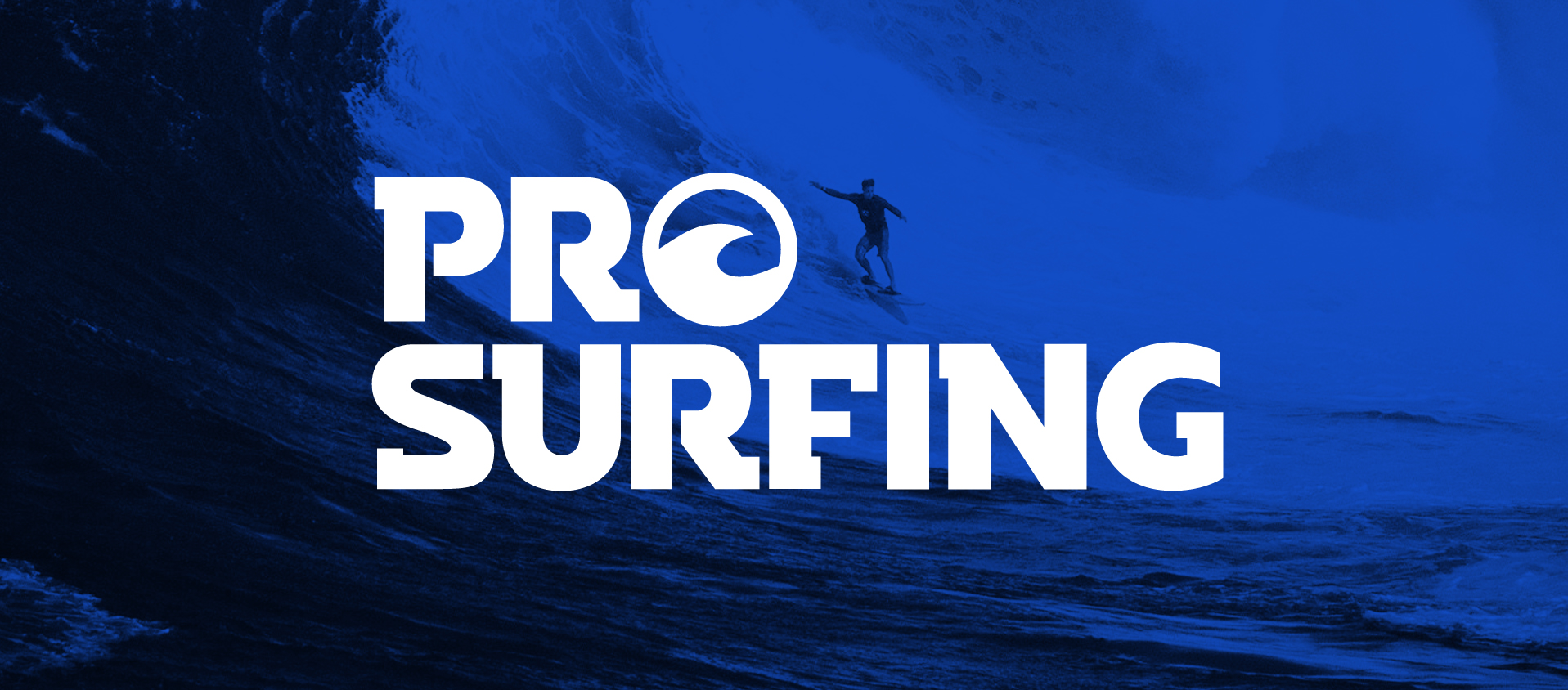
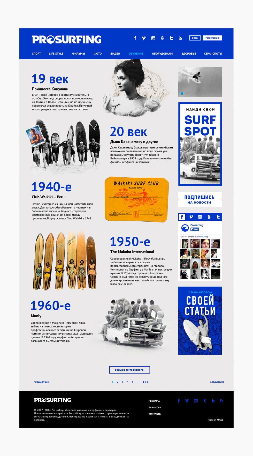
 - PROSURFING

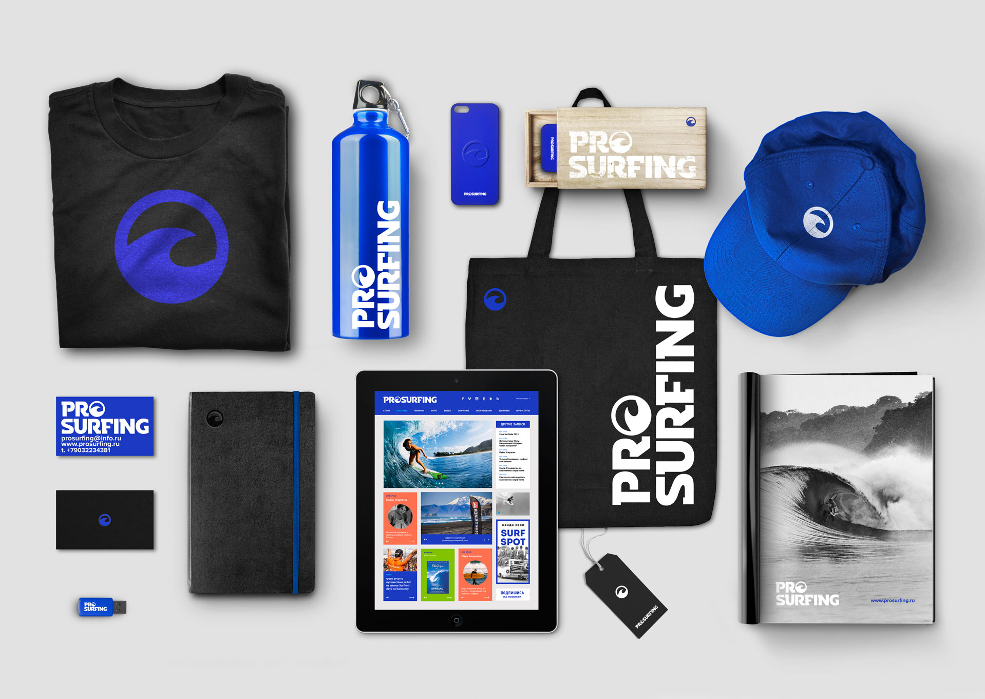
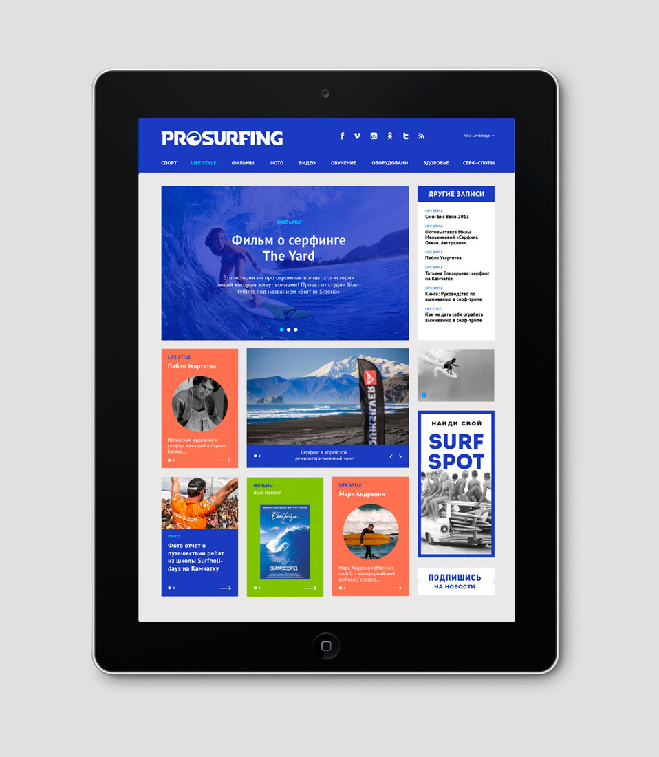
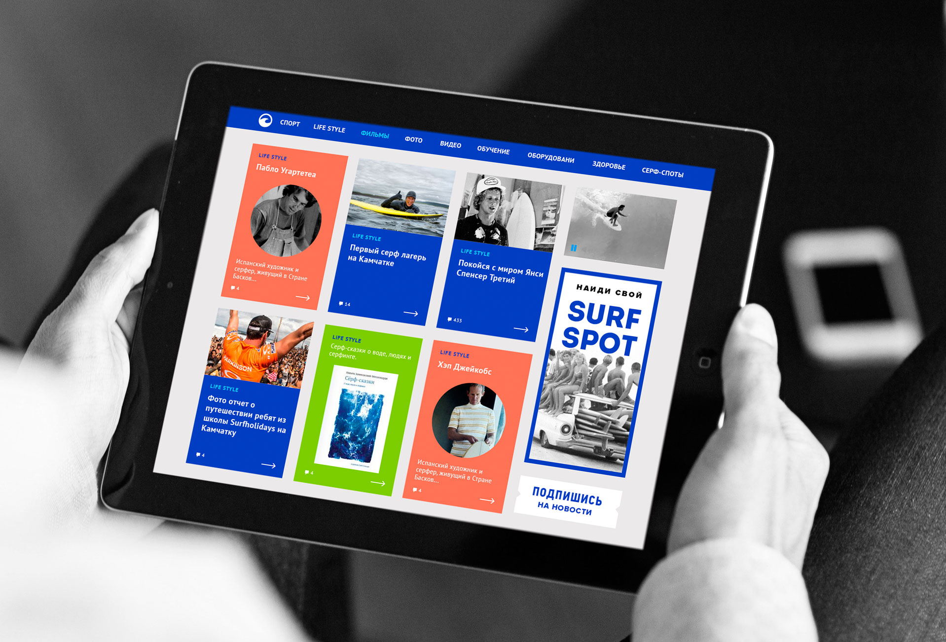
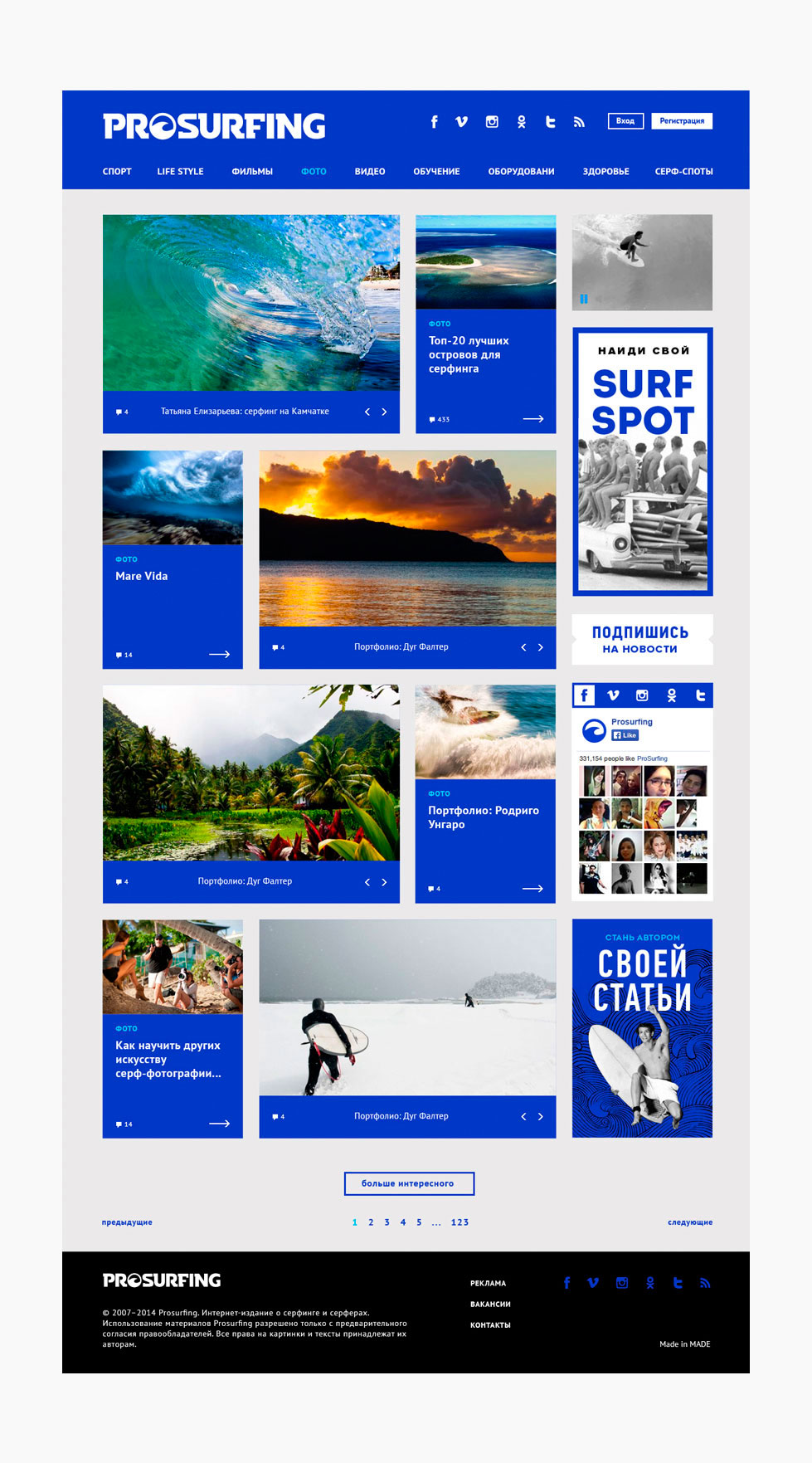
Prosurfing online magazine team approached us with the request to develop a new logo, corporate style, and website. 
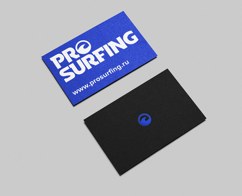
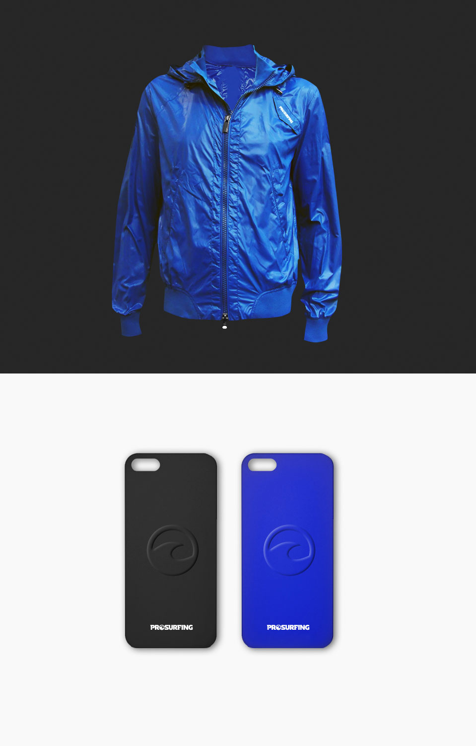
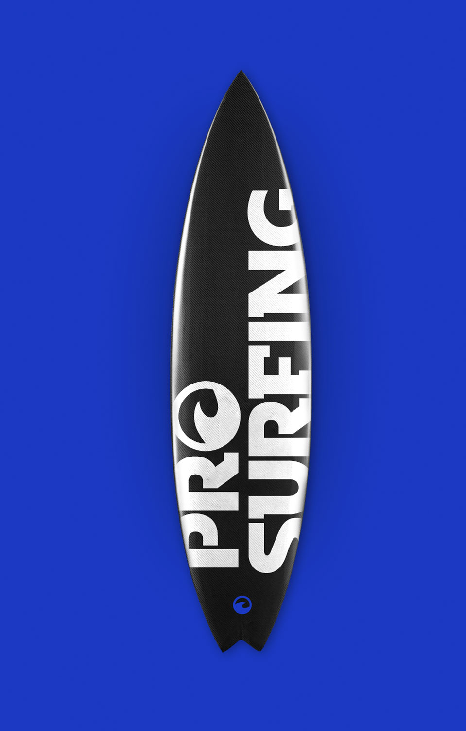
We have developed a minimalistic logo with a unique script design and a mark easily adaptable for various carriers. We have developed a fashionable, bright, and recognizable corporate style. The main color chosen was trendy cobalt directly associated with surfing.
www.PROSURFING.ru

THE PROJECT WEBSITE INFORMS ABOUT ALL IMPORTANT SURFING NEWS.

In addition to the news, educational and entertainment directories, the website provides the opportunity to find conveniently located surf spots for beginners and professionals using an interactive map.

The website design supports the general brand’s bright minimalist style. Additional colors were selected for the main directories, allowing users to immediately see the target subjects at the home page.
scroll down